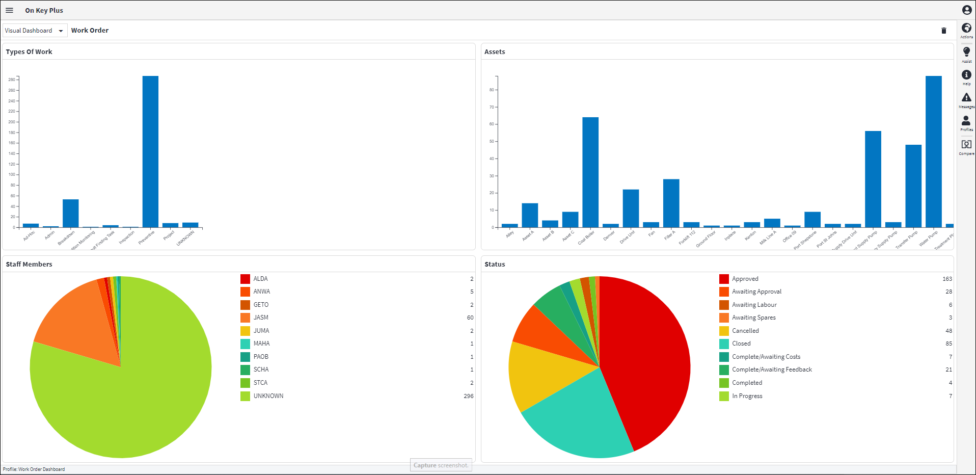
Visual Dashboard
The visual dashboard provides a visual perspective to the grid data by using charts that are interactable.
The visual dashboard is available from the following dashboards and can be accessed by selecting visual dashboard from the dropdown:
- Work Order Dashboard
- Costing Dashboard
Using Visual Dashboard
The Visual Dashboards are divided into four chart sections. These can be changed by using the ‘Clear All’ delete icon available on the dashboard. This will delete all the charts from the dashboard, whereafter you can create your own charts by clicking on the ‘Add Widget’ or ‘Use Preset’ icons seen on the chart areas.
The following charts can be configured:
- Column bar charts
- Pie charts
Once the charts have been configured the dashboard can be saved using normal Profile functionality.
Adding Charts
There are two ways to create charts on the dashboard:
- Add Widget provides the ability to filter, sort or group that data before the required chart can be selected (only column bar chart can be used). You can specify the Chart Title, the X and Y-Axis fields, the Rotation and Bar Colour, and then the chart can be displayed in the Chart Section.
- Use Presets provides the ability to select a Preset Chart. These are out-of-the-box charts that have been pre-added. Presets display the Column grouping and the number of records.
The following Preset charts are available:
- Column Bar Chart:
- Assets
- Events
- Failure Cause
- Failure Component
- Failure Mechanism
- Failure Mode Type
- General Ledger
- Origin
- Section
- Site
- Staff Member
- Status
- Trade
- Type of Work
- Pie Charts:
- Staff Member
- Status
- Type of Work